F2 Technologies
Brand Manual
The definitive reference for executing the F2 identity. Lead with the rule, read the rationale, follow the examples. Built for the founder, freelancers, partners, and future hires — open it and ship correctly.
Quick reference
Everything needed to produce a single asset, on one screen. If you read nothing else, read this.
Ink
Bone
Amber
Brand foundation
Why F2 exists and how it carries itself. Short, so the rules below have something to stand on.
Engineered intelligence, built to fit.
Build AI automation that fits a company exactly — engineered, not templated.
A Brazil where serious AI engineering is the standard, not the exception.
For teams that have outgrown off-the-shelf tools, F2 Technologies is the AI studio that engineers custom automation — the depth of a software team with the restraint of a design studio.
We earn trust by understanding the system, not demoing the surface.
Fewer parts, better placed. Calm beats loud, every time.
Each build is shaped to one company. Templates are a starting point, never the product.
We let precision speak. No hype, no exaggerated promises.
Founders, operations leads, and technical managers at Brazilian SMBs and scale-ups who feel the ceiling of no-code tools and want automation that holds up in production.
Reference energy: Linear and Raycast — an engineering tool, not an agency.
Logo system
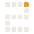
F2 is a keyboard function key, so the mark is the key. The Keycap is the master; the Module is the companion symbol for tight and favicon contexts.
Minimum clear space on every side equals half the keycap height (½ x), where x is the cap. For the wordmark, x is the cap height of the “F”. Nothing — type, edges, other logos — enters this zone.
Full lockup minimum: 96px wide. Below that, drop the wordmark and use the symbol. At 16px and under, switch to the solid app-icon tile or the Module — both stay legible as a square.
- It's the primary brand lockup or hero
- You need the app icon / install tile
- Space allows the full mark at ≥96px
- You need a standalone symbol or favicon
- Building patterns, loading states, diagrams
- The keycap would read as clutter beside other UI
// If F2 ships Keycap alone, drop Module and use the keycap silhouette for all symbol-only uses.
Color
Two neutrals and a single flat accent. Amber carries one meaning everywhere: the active node, the live cursor, the key edge, the output. Keep it to roughly 10% of any surface. The same palette drives two themes (dark by default, light on demand) by reassigning roles, never by adding colours. Product interfaces additionally draw on two carved-out families, status and chart, which never appear in marketing, decks, letterhead or the logo.
#0B0D11
#15181E
#1B1F26
#2A2F38
#3C414B
#6E727C
#8B8F99
#A6A9B2
#C7C8CE
#F6F5F0
#ECEAE2 = bone
#DEDBD0
#CFCBBE
#B7B2A3
// Semantic colors live in product UI (status, validation), and these three hexes are fills: a badge background, a chart mark, a border, at any tint. For status as text, see the two blocks below. Warning is held distinct from Signal Amber in meaning, not reliably in appearance: measured, the pair is ΔE 6.1 apart at normal vision and 4.1 under deuteranopia, and Success and Error collapse to ΔE 4.2 under deuteranopia. So never use the status trio as a set of categories, and never place an amber mark and a warning badge in one view without a second cue.
// The status trio splits into two roles, exactly as amber does. As a fill (badge background, chart mark, border) each stays its base color in both themes. As text on a light surface the base colors fail badly: success 2.17:1, warning 1.52:1, error 2.68:1 measured inside the badge tint they sit in (2.43 / 1.63 / 3.12 on bare bone). So a status LABEL takes --f2-success-text / --f2-warning-text / --f2-error-text, which darken to the deep trio on light.
// On dark the success and warning fills read fine as text, so those two aliases stay. Error does not. #D85C57 is 4.99:1 on the page surface but 4.40:1 on a card, and 3.74:1 inside the 14% tint a status badge draws behind its own label. Lowering that tint cannot fix it, because the untinted card is already under the floor, so --f2-error-text takes --f2-error-lift #EB6D67 on dark: hue and chroma held, OKLab lightness walked up until every dark surface a status label sits on clears 4.5:1. Worst case 4.63:1. The fills do not move, so nothing already drawn as a fill changes.
Blue and violet stay barred from brand and marketing surfaces. These exist so an interface can tell one data series from another, under the same carve-out the status colors already have: they never appear in marketing, decks, letterhead or the logo.
// Three series colors, and only three. Once marks clear 3:1 against the surface they sit in a lightness window about 0.115 wide, so lightness carries roughly two identities and hue must do the rest. Green is Success, yellow-olive is Warning, orange is Amber, red is Error, and teal has almost no chroma left at those lightnesses, so 230-335° is the only arc remaining. A fourth hue inside it drops the worst pair to ΔE 2.2. Three holds at ΔE 15.4 at normal vision and 9.4 across protanopia, deuteranopia and tritanopia, in both themes, computed all-pairs rather than adjacent-only. These labels are deliberately not painted in their own colour: as text, magenta is 3.54:1 and indigo 3.65:1 on ink, and azure-deep 4.03:1 on bone, all under the 4.5:1 floor. A chart colour is a mark, never a text tier.
#D7EAFE
#ABD4FD
#6EB7FB
#1C97F3
#1375BF
#0C5891
#063F6B
// One hue, for magnitude rather than identity. Steps 400 and 500 are the slot-1 values, so a chart mixing a series with a ramp stays in one family. Use the full range for continuous magnitude; for discrete ordinal marks use 400→700 on light and 100→500 on dark, so every step still clears the surface.
- Fixed order: 1 → 2 → 3 → Other. Never cycle. Slots 1 and 2 are the most separable pair, so the common two-series chart gets the best one. If a chart needs a fifth category, fold the tail into Other; do not reuse a color.
- Other is residual. It is deliberately near-neutral so "Other" recedes. Never assign a real category to it.
- Amber is emphasis, not a series: the selected series, the current period, a single-series chart. It sits above the categorical lightness band and would always read as the important one, and as a slot it would spend a third of every chart on the accent. On light it takes amber-deep #9A5A14, exactly as accent text does: raw amber is 1.93:1 on bone, and a mark has to be read, not merely seen.
- Chart colors and status badges can meet. Azure and Success are ΔE 4.4 apart under tritanopia, and Other and Success 6.1 under deuteranopia. Status badges always carry a text label, so color is never their only encoding. Keep it that way.
- Thin strokes need more. Lines render far less color than fills: minimum 2px, and where a stroke is the only encoding hold it to 4.5:1 rather than 3:1. On dark, a three-series line chart must direct-label or use a tooltip rather than rely on the legend.
- Anything compared all-pairs (donut, scatter, small multiples) caps at three plus Other.
Roughly 60% neutral ground, 30% secondary surface, 10% amber. If a layout feels busy, it is over budget on amber. The accent earns attention precisely because it is rare.
// Amber splits into two roles. As a fill (button, node) it stays #E59A3C in both themes — label it in ink. As text on a surface it must clear contrast: amber on ink is fine, but amber on a light surface fails — so accent text darkens to amber-deep #9A5A14 on light.
// "Worst case" means one thing everywhere in this section, so any figure here can be reproduced: the backdrop is the base fill at 14% alpha, composited in 8-bit sRGB over the surface the component sits on, and the label is the matching -text token. 14% is Badge, the highest alpha anything paints; Alert, Banner and Toast use 12% and FileUpload 8%, so none of them binds. The tint is always mixed from the fill, never from the -text colour, because that is what the components draw. The binding surface flips per theme: on dark it is the card #1B1F26, the lightest dark surface; on light it is the page #ECEAE2, the darkest light surface.
// The three status FAILS figures are measured where a status label actually sits: inside the badge's own 14% tint over bone, not on the bare surface. On bare bone the same fills read 2.43 / 1.63 / 3.12, still far under the 4.5:1 floor, so the rule does not change.
// Amber as text only on ink at body weight and up; on a light surface it darkens to amber-deep #9A5A14. On amber fills, label in ink — never bone. Re-check contrast whenever a new surface enters the system. No gradients are used anywhere — flat fills only.
Typography
Geometric display in Space Grotesk; the technical signal in JetBrains Mono. Two faces, used with discipline, keep the whole system tight.
Space Grotesk is geometric and exact but has just enough character to avoid the Inter/Helvetica default. JetBrains Mono is a real engineering typeface — it signals “we work in code” honestly, not as decoration. Together they read technical-premium: precise, calm, never an agency.
Reach for JetBrains Mono only when something belongs to the system layer: labels, metadata, status tags, code, captions, the cursor. It frames and annotates — it is not for headlines or body. Used sparingly, mono stays a signal; everywhere, it becomes noise.
Use Space Grotesk for body text at 16–18px / 1.6 line-height. Keeping one display-and-text face holds the system tight and unmistakably F2. Introduce a neutral text companion only if a genuinely long-form context (a 2,000-word article, dense legal copy) proves Space Grotesk tiring to read — and document that decision here when it happens. Until then, one face.
Both faces carry full Latin-Extended diacritics, so Portuguese accents (ã, õ, ç, á, ê) and English set identically. Never substitute a face that lacks proper PT-BR accent forms.
Brand elements & art direction
A small kit of parts — the modular grid, the active node, the keycap, the square wave, the cursor — recombined into texture, dividers, loading states, and diagrams.
Uniform cells, consistent gaps
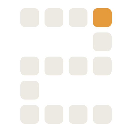
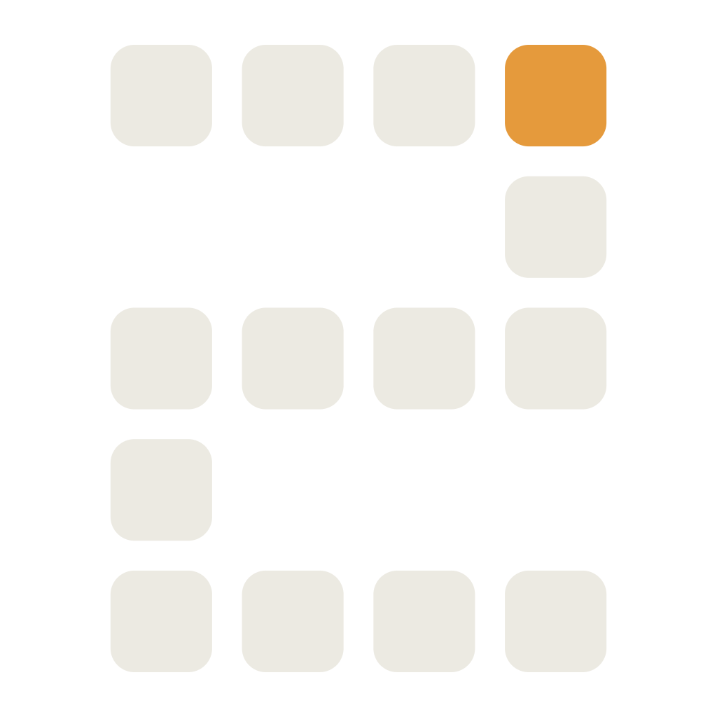
Everything is built from one unit: a rounded square on an 8px grid with a 12px gap. Repeat it for backgrounds and section textures, subtract cells to draw forms (the Module 2), or animate cells to make loading states. The logic is ownable and infinitely extensible.
Line icons, 1.5–1.6px stroke, rounded joins, on a 24px grid. Monochrome bone; a single element may go amber to mark the active state. Geometric, never illustrative.
Abstract, geometric, systems-based — diagrams of nodes, grids, and flows, built from the same kit of parts. Illustration explains how something works; it never decorates. Flat fills, no gradients, no characters.
// Proposals and content use this house style — never raw n8n screenshots.
F2 takes a deliberate minimal-photography position. The system leads with abstract geometry, not imagery. When a photograph is genuinely needed (a team page, an event), use restrained, high-contrast, desaturated shots with generous negative space — never stock-AI renders, lens-flare tech imagery, or staged “innovation” scenes. If in doubt, use a diagram instead.
Voice & tone
Calm, precise, confident, anti-hype. Say the specific thing, drop the adjectives, and let the work carry the weight.
Concrete nouns, exact numbers, no vague claims.
No exclamation marks, no urgency theatre. Measured.
State things plainly. Confidence needs no hedging or hype.
No “revolutionary”, “game-changing”, or “powered by AI magic”.
Portuguese is the home voice; English is for international and technical contexts. Translate the intent, not word-for-word. PT-BR stays warm but professional — use “você”, never overly formal “senhor”. Keep technical terms (agent, workflow, deploy) in English when that is how Brazilian engineers actually speak. The descriptor swaps with language: Technologies (EN) ⇄ Tecnologia (PT-BR); the name F2 never changes.
Short, declarative, no verb-stacking. The proof comes underneath, not in the headline.
Concrete result, conversational PT-BR, one idea per post.
Precise, structured, sets expectations. No selling — just clarity.
Applications
Dark mode is the default. Each surface uses the same kit — keycap, grid, node, mono labels — so the brand stays recognizable from a favicon to a billboard.
The official email mirrors the letterhead: ink header band with the keycap lockup, the amber node rule, a light Paper body with a single flat amber CTA, and the mono footer. Light is the canonical email surface; clients that honor prefers-color-scheme flip to ink.
Editable template and signature snippet — asset library (§13).
Motion
Motion confirms a state, it never performs. One consistent ease, short durations, and signature animations drawn straight from the kit.
One ease for nearly everything: quick out, settled in. Avoid bounce, elastic, and overshoot — they read playful, not precise.
// All motion respects prefers-reduced-motion — it stops cleanly, never degrading legibility.
AI usage guidelines
F2 is an AI studio, so it uses generative tools — on the record and on-brand. These rules keep AI output indistinguishable from hand-made F2 work.
- First drafts of copy in the F2 voice
- Layout variations from the kit of parts
- Diagram scaffolds in the house style
- Code for the design-system tokens
- Alt text, summaries, translations (PT⇄EN)
- Generate the logo or alter the marks
- Invent new brand colors or fonts
- Produce photoreal “AI” imagery (brains, robots)
- Publish client-facing copy unreviewed
- Fabricate metrics, cases, or testimonials
Human review is mandatory. AI drafts; a person decides. Nothing reaches a client or the public without a named F2 reviewer signing off on accuracy, tone, and brand fit.
Design tokens
The manual defines the decisions; the design system implements them. Three layers — primitive → semantic → component — with dark & light themes. Only the semantic layer flips per theme; build UI against the component layer and it themes for free.
:root {
  /* primitive */
  --f2-ink:        #101216;
  --f2-amber:      #E59A3C;
  /* semantic · dark default */
  --f2-surface:    var(--f2-ink);
  --f2-text:       var(--f2-bone);
  --f2-accent:     var(--f2-amber);
  --f2-error-text: var(--f2-error-lift);
  --f2-chart-1:    #1C97F3;
}
:root, [data-theme] {
  /* component */
  --f2-btn-bg:  var(--f2-accent);
}
[data-theme="light"] {
  --f2-surface:     #ECEAE2;
  --f2-text:        #101216;
  --f2-accent-text: #9A5A14;
  --f2-error-text:  #A62D2E;
  --f2-chart-1:     #1375BF;
}
{
  "primitive": {
    "amber": "#E59A3C",
    "ink":   "#101216",
    "bone":  "#ECEAE2"
  },
  "semantic": {
    "accent":      { "dark": "amber", "light": "amber" },
    "accent-text": { "dark": "amber", "light": "deep" }
  },
  "component": { "button.bg": "{accent}" }
}
// The status trio follows the same two-role split as amber: the base token is the fill, a separate -text token carries the label. Error is the one tone that needs a step in both directions, because its fill misses AA as a label on a card and inside a badge tint on dark, not only on light. The chart family (--f2-chart-1…3, --f2-chart-other, --f2-chart-emphasis, --f2-chart-seq-min/max) and the seven-step --f2-seq-100…700 ramp are product UI only, and they carry no -text companion. The status fills are shared across themes and so need a darkened label token; each chart slot already re-steps per theme, and the ramp is a fixed ladder each theme reads a window into. A chart colour is a mark, never a text tier: see section 04.
Governance
Direction and boundaries, then room for judgment. When something isn't covered here, apply the principles — precise, calm, flat — and propose the addition.
The manual, the design tokens and the @fabiofranco85/brand package share one version. tokens/f2-tokens.json is the source; npm test fails if a version stamp in the manual, the CSS/SCSS headers or the package drifts from it. It checks the stamps, not the prose: keeping the manual current with a release is an editorial step, not an automated one. Minor additions bump the decimal, a structural rework bumps the major.
All exceptions, new applications, and co-branding go through the Brand Lead before release.
- Flat fills — ink, bone, one amber
- Keycap as master, Module as companion
- Amber = active node, ~10% presence
- Space Grotesk + JetBrains Mono
- Dark mode default; clear space respected
- Calm, precise, anti-hype voice
- Human review on AI output
- Status and chart colors: product UI only
- Gradients, glows, decorative shadows
- Blue or purple as brand colors
- Stock-AI clichés — brains, robots, gears
- Stretching, recoloring, or crowding the mark
- Marketing hype or fabricated claims
- Fine textures or busy backgrounds
- Raw n8n screenshots in client work
- Chart or status colors in marketing or decks
Asset library
Every mark, in every format you'll need. SVG for design, PNG for everywhere else, plus favicons and design tokens. Grab the full kit or pick a single file.

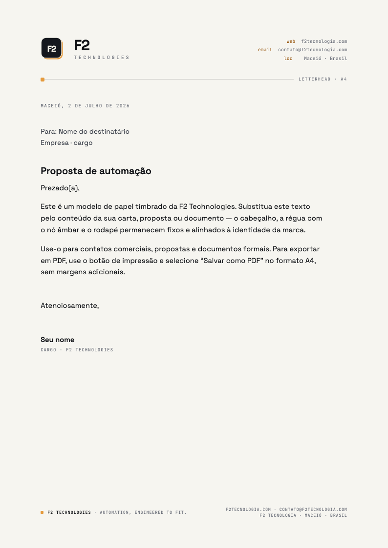
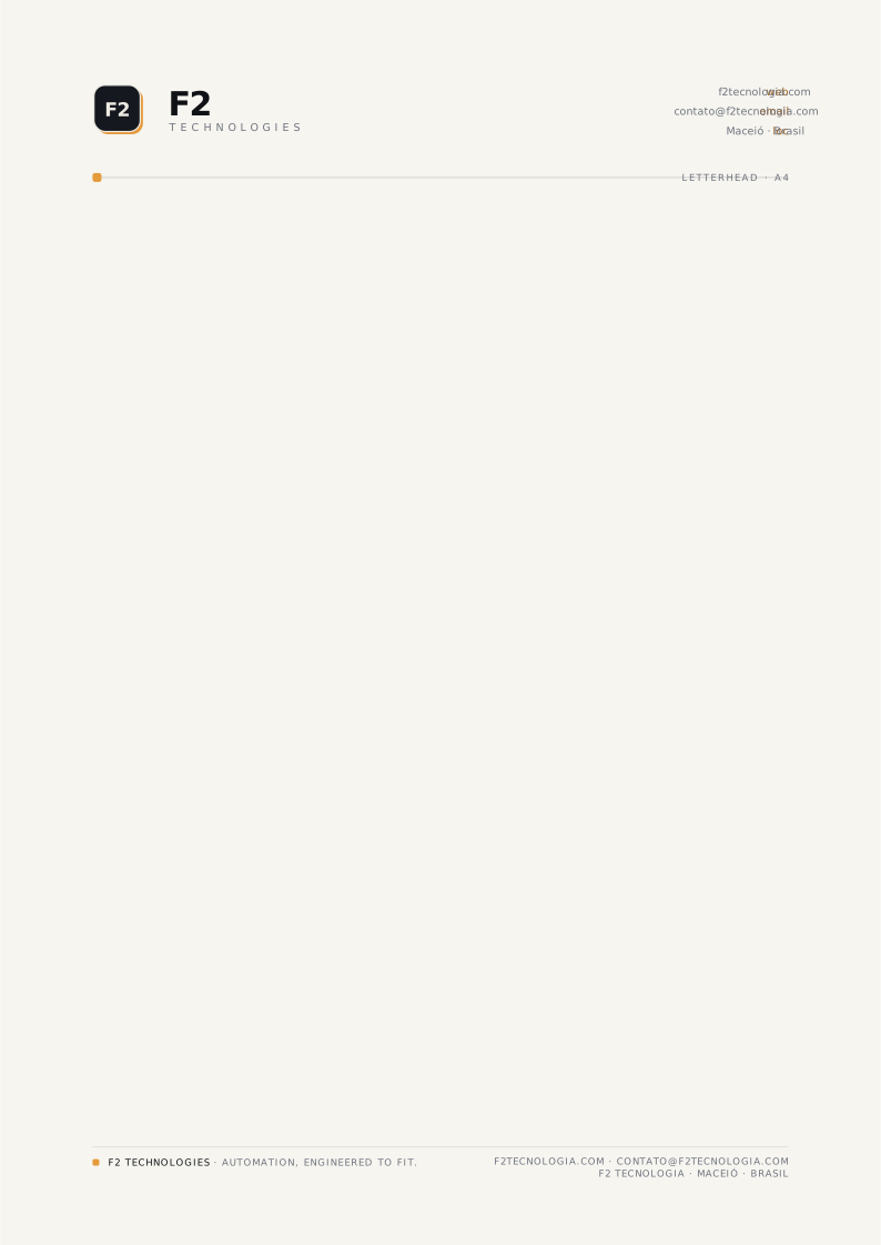
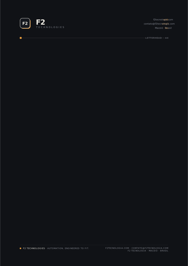
On-brand A4 stationery — keycap lockup, the amber node rule, and a mono footer. Start from the editable HTML template (fill in the fields, then Print → Save as PDF), drop text onto the print-ready PDF, or open the SVG in a design tool.
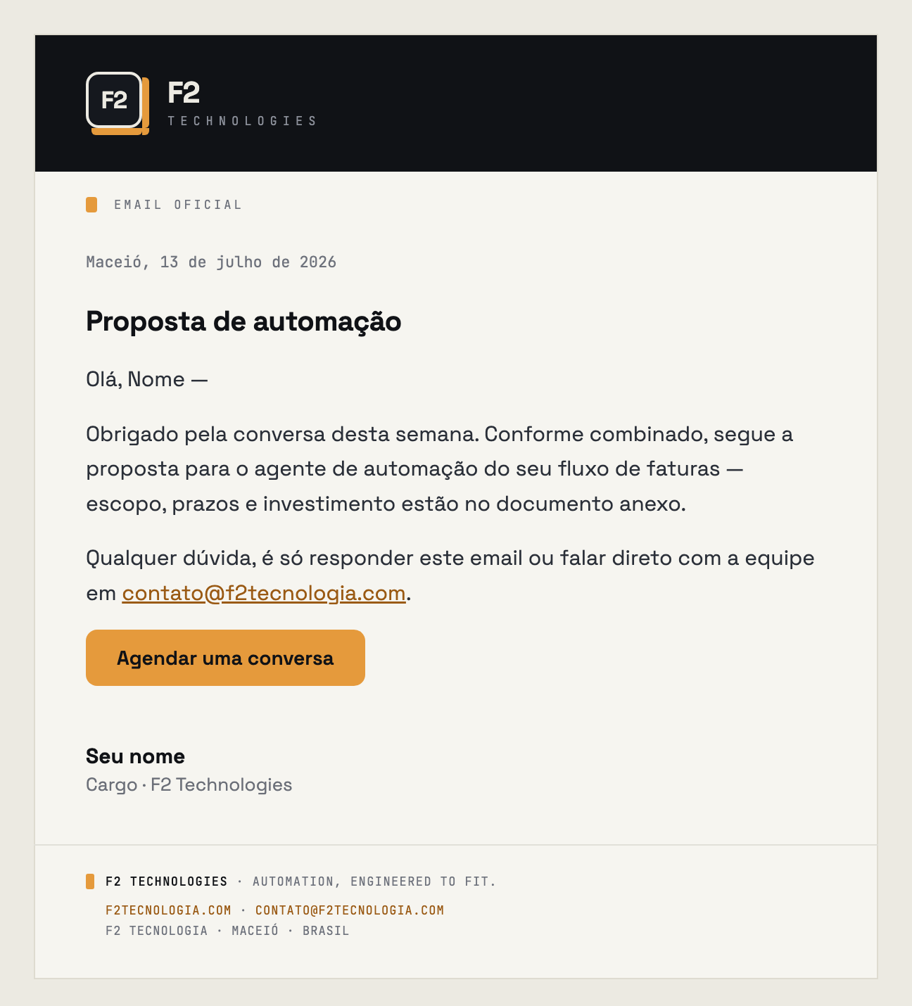
The company's email layout — ink header band, the amber node rule, light Paper body, mono footer. Edit the fields in the template, then Copy email HTML into your email tool. The signature copies as rich text for Gmail/Outlook settings.
Drop-in web icon set — multi-resolution .ico, scalable SVG, Apple touch icon, and a web manifest.